Wielding Color
In this Positive Impact article for Mix Interiors, Judith van Vliet talks about the impact color can have on our direct surroundings and lives.
How does color impact your life?
Have you ever wondered why you feel the way you do in certain spaces? Do you feel anxious in a yellow room? Does the colour blue make you feel calm and relaxed? Artists and interior designers have long believed that colour can dramatically affect moods, feelings and emotions.
One of the first to study colour was Isaac Newton back in 1660 and still today people are studying its effects on the human psyche. In 1911, the Theory of Colours was published by Russian artist Kandinsky who claimed that colours cause the human soul to vibrate and stated that colour was a powerful tool to influence human beings as physical organisms. “Psychologically, said Kandinsky, it has been proven that a red light can excite and have a stimulating effect on the heart, while the blue colour can even cause a temporary paralysis”. Kandinsky for those who may not know was also a synesthee, he would see colour when listening to music. Approximately 3 to 5 percent of the population has some form of synesthesia (when ones sense comes through as another). But where does leave the rest of us? Can we learn to understand how some colours make us feel? What power do designers and architects have by influencing our surroundings and perhaps even, enhance our emotions?
By all accounts it is a topic of great interest especially for the Big Five. Back in 2019, Google designed A Space for Being during Milan Design Week where they had partnered up with scientists to show the importance of design and its impact on our health and well-being. Three slightly contrasting interior spaces were designed according to the principles of neuroaesthetics that would show how visual aesthetics impact our brain and physiology. Various textures, sounds, lights and scents were used to stimulate the visitors’ senses in a different way and understand how these may impact us negatively or positively. Now even if the study did not focus only on colour but merely the overall experience, it did the importance of objects that we surround ourselves with and that designers have a great impact on the choices we make each and every day.
Dialling back a little bit on why a company like Google would do such a study. I think we can all agree that once big tech knows how we feel in certain moments, it will sell this data to the highest bidder who in return will hopefully be encouraged to design better and apply colour into our lives more fittingly. But what is the true question here? Not how can we sell more according to peoples’ preferences. No, the question is, how come we have lost connection to our own intuition on what feels good colour-wise and what does not? In a world where algorithms show us where our main interest lies according to our buying patterns online, our connection with our own personal preferences and styles have diminished over time. Are we on autopilot and how we go back from here?
Interesting therefore is the new campaign by Argos who has partnered up with Ogilvy UK to encourage people to decorate their homes in styles and colours that reflect more accurately their personality. The British retailer has launched a series of YouTube videos called “Make Yourself, At Home” hosted by interior designer Siobhan Murphy. Fascinating enough the campaign makes use of an AI tracking device to monitor how each family emotionally responds to aesthetic input on a large screen. The homes are then filled with products to which the family had a positive emotional response to.
One of the main reasons for Argos to perform such campaign is the increasing use of greys and beiges in our homes over the past decades, in contrast to the opulent colours of earlier decades. Remember the famous interiors of the 60s’, early 70s’ decorated in avocado green, harvest gold and burnt orange? A late British study however has showed how the colours grey, black and whites made up for about 15% of colours around 1800 whereas now they make up for over 50% of colours used in our direct environments. Now remember that in colour psychology we learned that grey does not provoke any emotion at all as it is a true neutral, where does that leave black and white, grey being a mix of both? No wonder we humans are not stimulated to use colour living in a colourless world as research shows that the less we are surrounded by colour, the less we are encouraged to use it or even grow afraid of colour. Is technology the answer to our colour phobia and will it truly connect us with our intuition?
Perhaps the next time you enter a space for the first time, take the time to understand how you feel in that particular space and what role the colours play in this overall experience. Because the answer to how colour makes us feel, lies deep within ourselves if we listen carefully enough.
First published in Mix Interior Magazine.
Neutrality with a pop of happiness
As the European fair season is coming to an end, it is time to have a look at which colours are waiting for us as we move into 2023.
By Judith van Vliet
As the European fair season is coming to an end, it is time to have a look at which colours are waiting for us as we move into 2023.
Whether you visited Milan Design Week, Maison & Objet, Cersaie or Dutch Design Week, it was clear that colour is back on the agenda. Yet the colourways we are seeing are not the obvious ‘in-your-face’ reds, blues and yellows sided by the usual blacks and whites. What we are starting to see is the entry of secondary colours that still elevate your energy without leaving you feel overpowered.
As we are putting ourselves out there again after two devastating years of pandemic, an unpredictable world is presenting itself. We are carefully optimistic yet cautious. Topics like climate change, economic recession and the rise of populist political movements create an uncertainty also at consumer level. Yet there is a shift happening as we feel a new energy coming through, a swift of emergence as we move into 2023. Longevity is a major topic among many designers even if nobody seems to want to fall back on the habitual neutrals that we have grown tired of. And that is good news. A new page is written as more vigour is brought onto the stage.
Where neutrals in the previous years were your old bunch of greys, blacks and whites, we now see a quest for a broader push of what is considered natural. Just like after the Spanish flu, white is popular for the upcoming season yet not the sterile white as you may expect but subtle, coloured whites that add a new dynamic to product and interior. Slightly greyish, beige-toned whites that recall stones, pebbles and naturally weathered woods coming from genuine surroundings that bring in warmth and comfort to our homes. Tactility is key as different textures create interesting layers of complexity to the applied colour. From the cooler side of the colour spectrum, we see nuanced neutrals moving into mineral areas of blue-green undertones adding a playful and serene effect as they are applied to as well gloss as matte surfaces.
Yet who said neutral had to be light in colour? For next year we see an increased use of darker wood shades often combined with warm red and orange tones. Interestingly, one of the biggest growing areas of colour is that of the terracotta shades. From the spicy orange and reds to darker burnt shades, moving into the browns. Shades that impart for dynamic statements while at the same time providing longevity. Terracotta was big during the pandemic as it was sided by these warming browns as we searched for stability in uncertain times. As these unknown times seem to continue, we pursue our need for warmer, darker shades as the brown tints remain popular. Fascinating is the continuation of bronze and brass metallics now being mixed with the nuanced neutrals and natural woods.
Coloured neutrals bring lightness, airiness and dynamism but also, they settle us down as they are calming and are easy on the eye. An important factor today as stress levels are very high and consumers are overwhelmed by all of the changes in society happening in a very short time. Spaces that bring tranquility, peace and silence will stand side by side with those that energise and stimulate our senses as we are hungry for new experiences and sensations.
MDW23
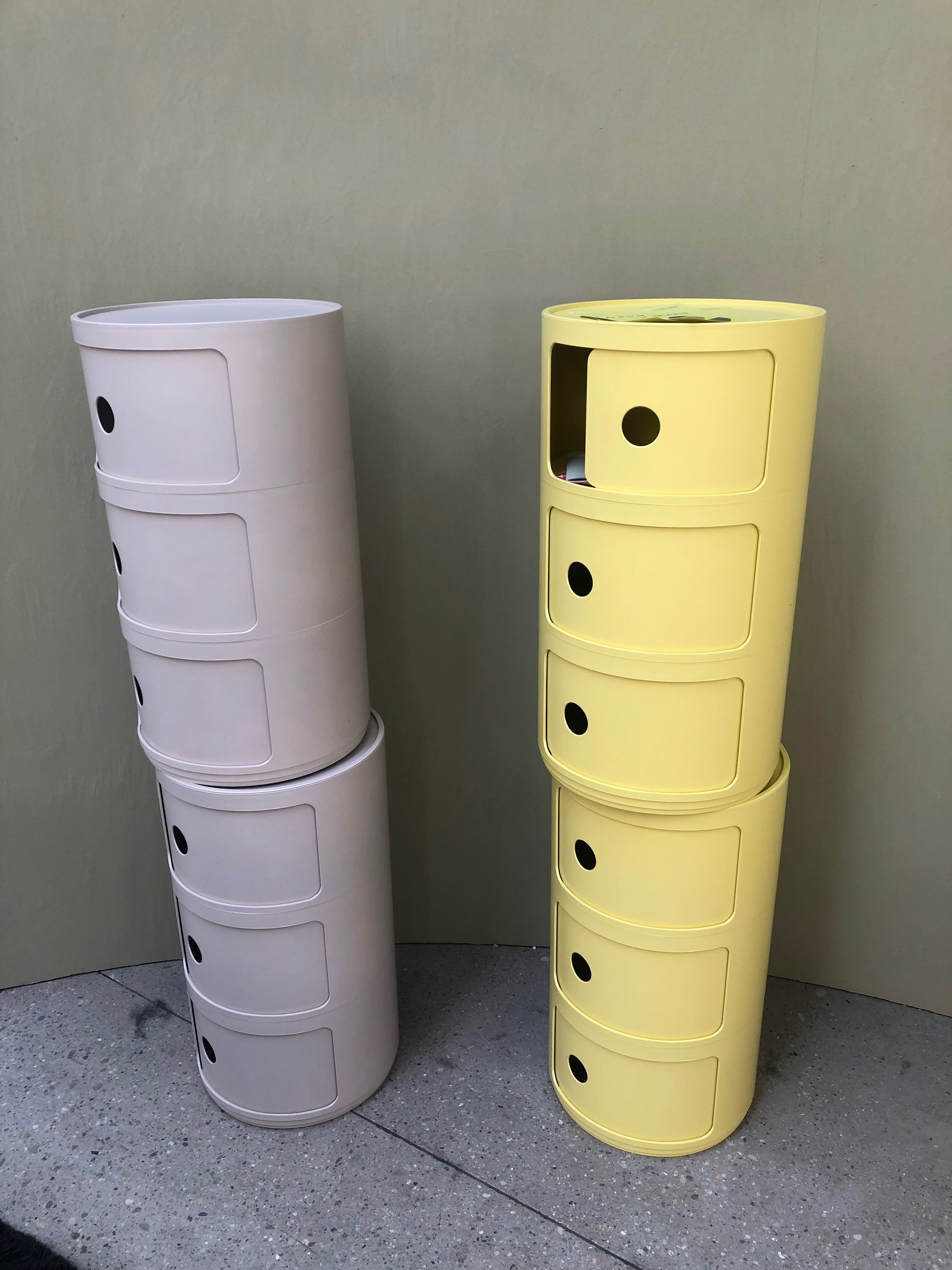
Even if the new neutrals take up an interesting area in design for the next season, uplifting pops of colour are moving in strong. Zesty, yellowish oranges not only bring along happiness but also the much-needed energy. Eggnog yellow is making an interesting intro by adding an element of lightness and hope, whereas accents of absinth and malachite green add the right amount of tolerated craziness.
Mohd
And finally, an important note to the purples and lilacs as they are growing in importance. We may see the softer bluish lilacs as well as the darker redder purples applied to different types of materials varying from velvet to suede and even outdoor textiles. The colour purple stands for technology yet most importantly it stands for being different, for breaking the rules, a great promise and welcoming characteristic.
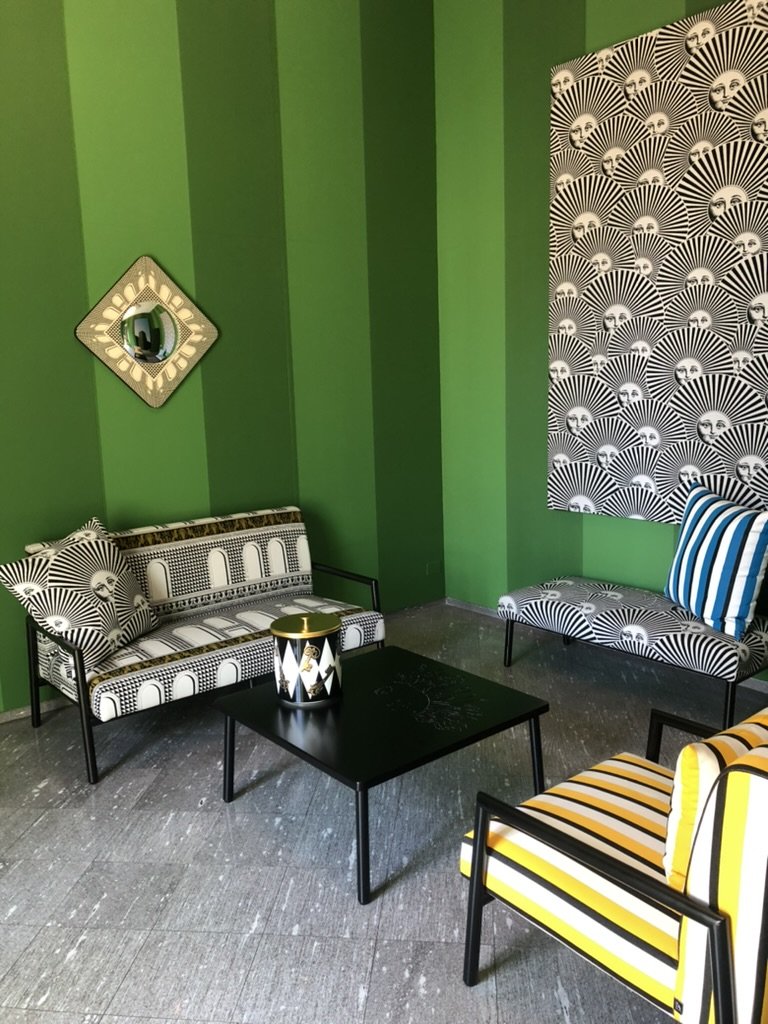
Fornasetti
The upcoming season is one of minimalism with the right amount of opulence. Spaces that are restful yet energising, allowing for consumers to choose according to their own specific needs and emotions. More than ever is colour convincing us of its significance.


